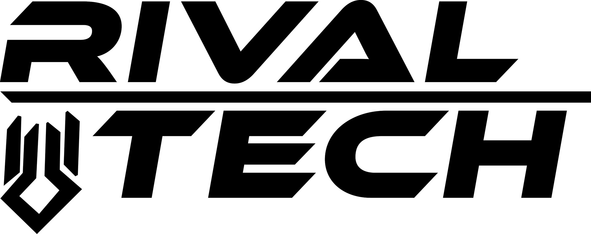
Logo Concept - Throughout the creation of this logo, I undertook a design process of creating a logo for a fictional company within the videogame Deep Rock Galactic, developed by Ghost Ship Games. Within, the game there are two companies mining a moon on the planet known as Hoxxes IV: Deep Rock Galactic & Unnamed Rival Company. The technology that is created from this company is known as Rival Tech, so I took it upon myself to create a logo for this company using Adobe Illustrator and Adobe Photoshop.
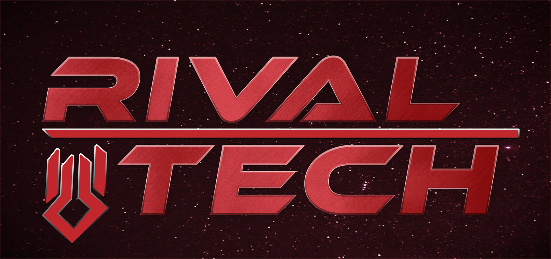
Final Product
Reference
Coffee Packaging - The following project is centered around the a fictional company from the videogame Deep Rock Galactic. I wanted to best mimic the style of the game whilst also creating something unique.
One of the minerals that you as the player mine within the game is known as Morkite, a teal colored crystal like mineral that is surprisingly dense. With this in mind, I started creating a brand with the given prompt of developing packaging for both a coffee cup and a coffee bean bag.
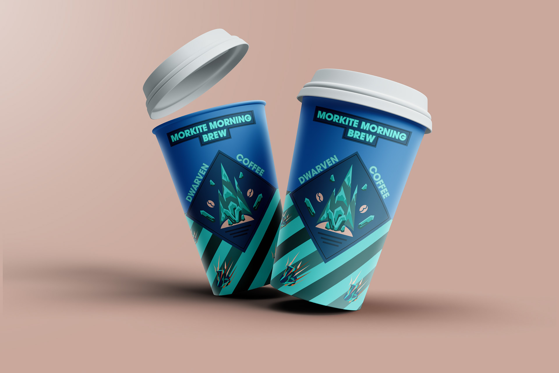
Coffee Cup
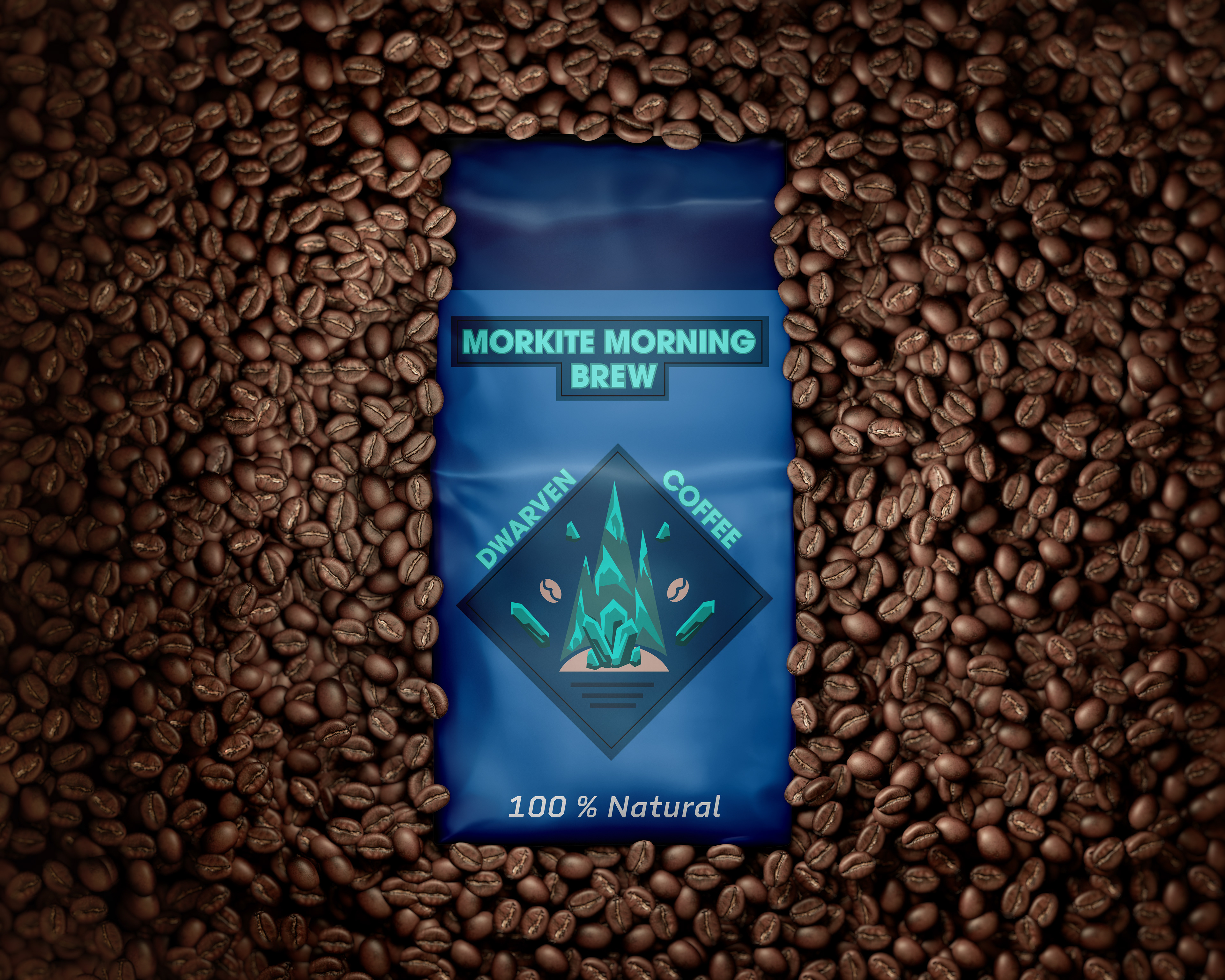
Coffee Bean Bag - Front
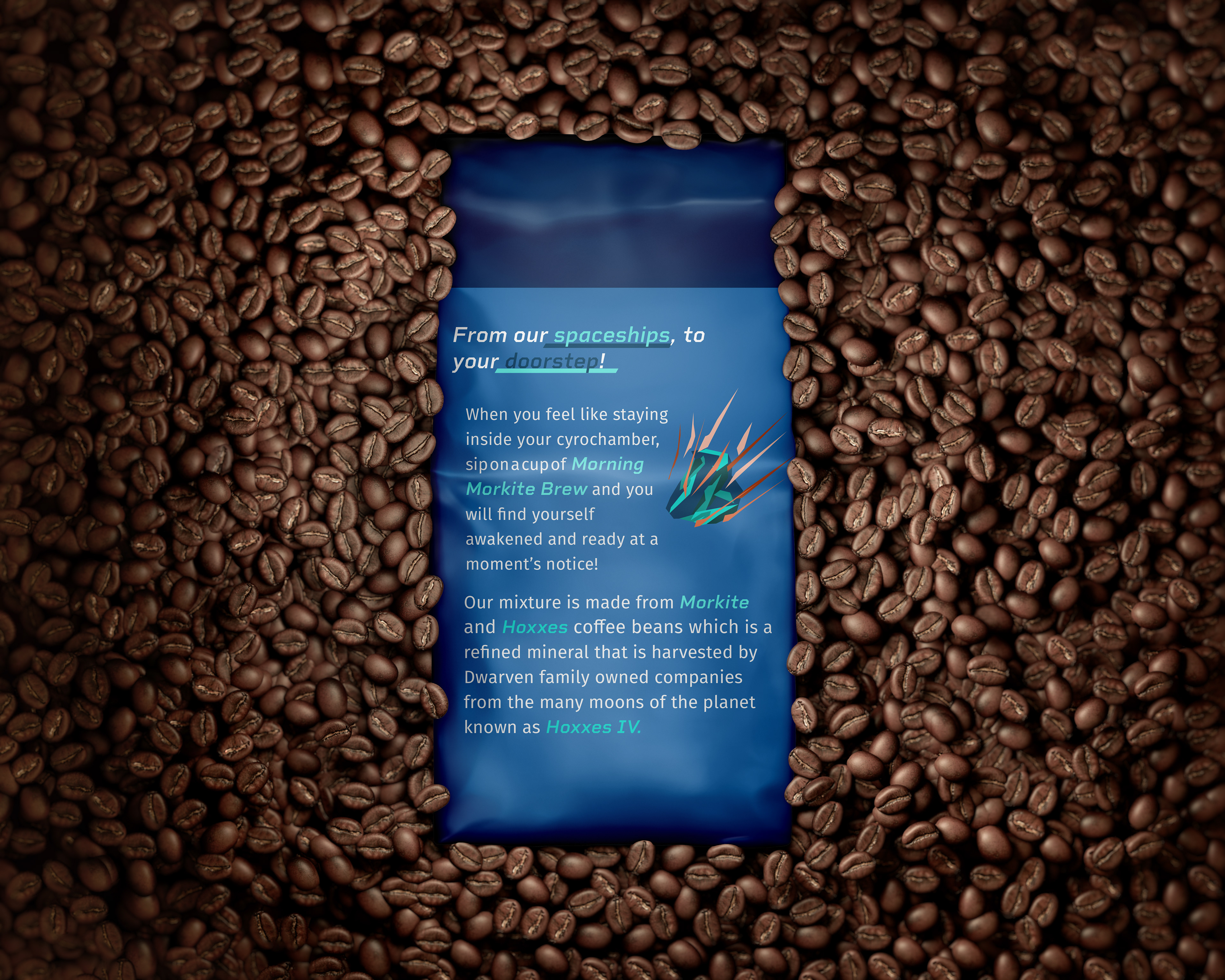
Coffee Bean Bag - Back
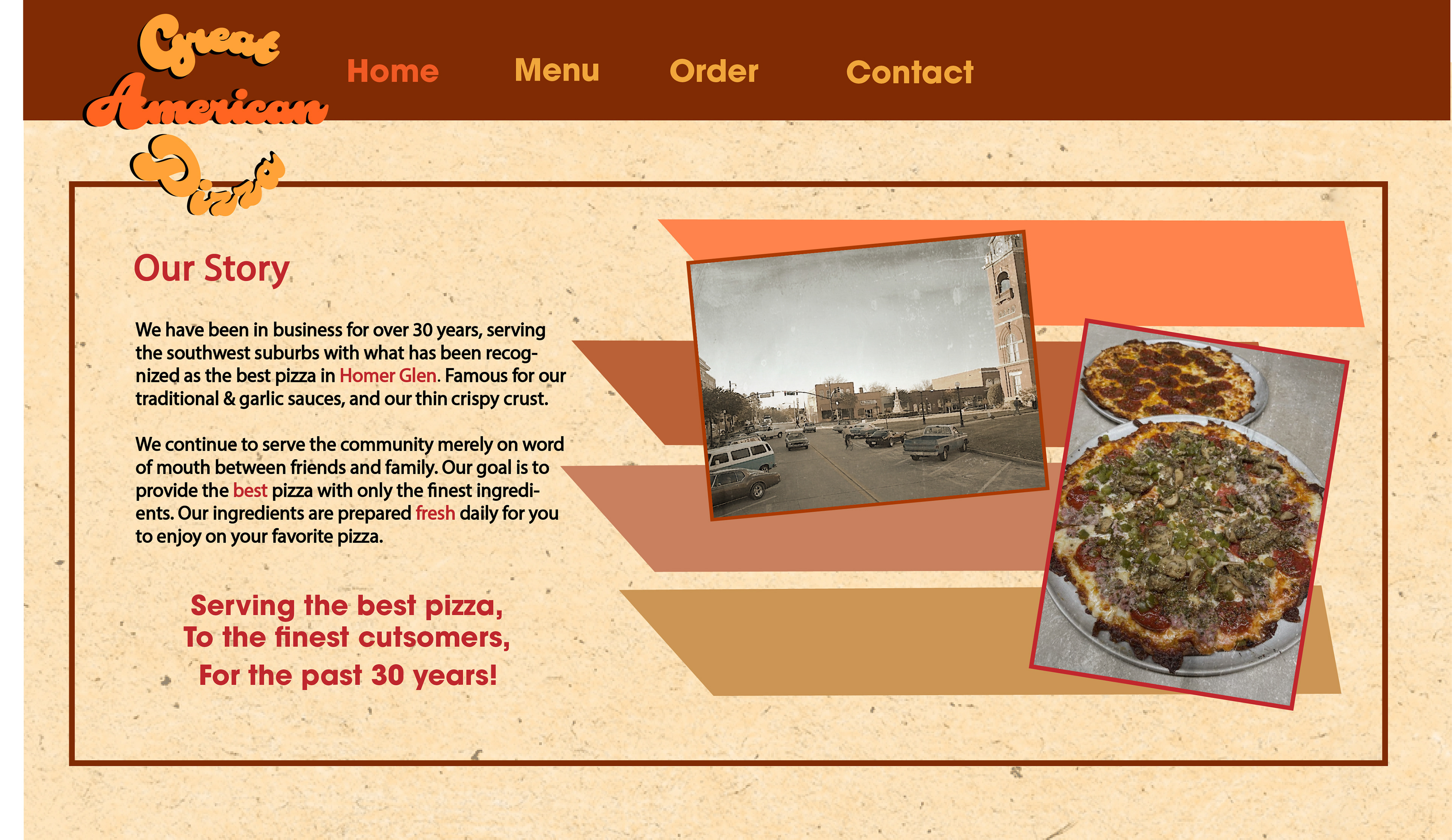
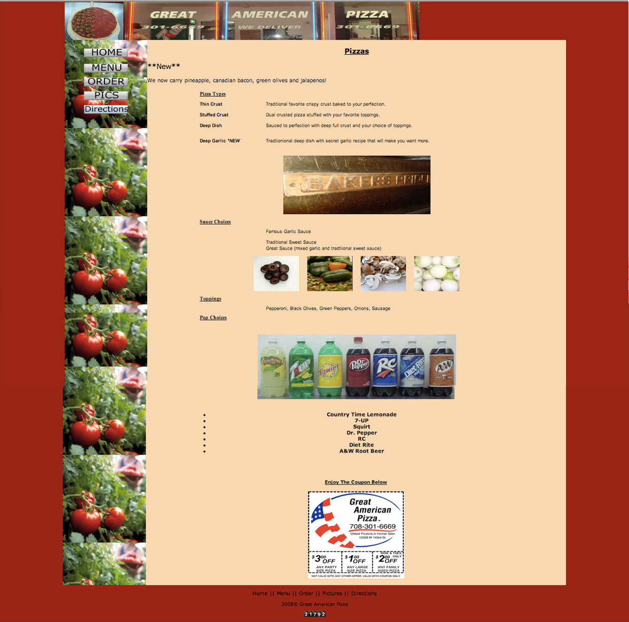
Rebranding Pizza Company - I was tasked with rebranding a former pizza company based out of Homer Glen, Illinois known as Great American Pizza. For this assignment, we were given the liberty of taking our own creative freedom to rebrand the following criteria: logo, website design, menu, color pallete, etc.
Great American Pizza ended up shutting their doors about eight years ago. But up until then, their branding stayed about the same with very little accommodation for creativity and/or change. My goal was to create a rebranding for this company that stuck with the retro identity of the brand whilst also keeping up with current trends in design.
Original Logo
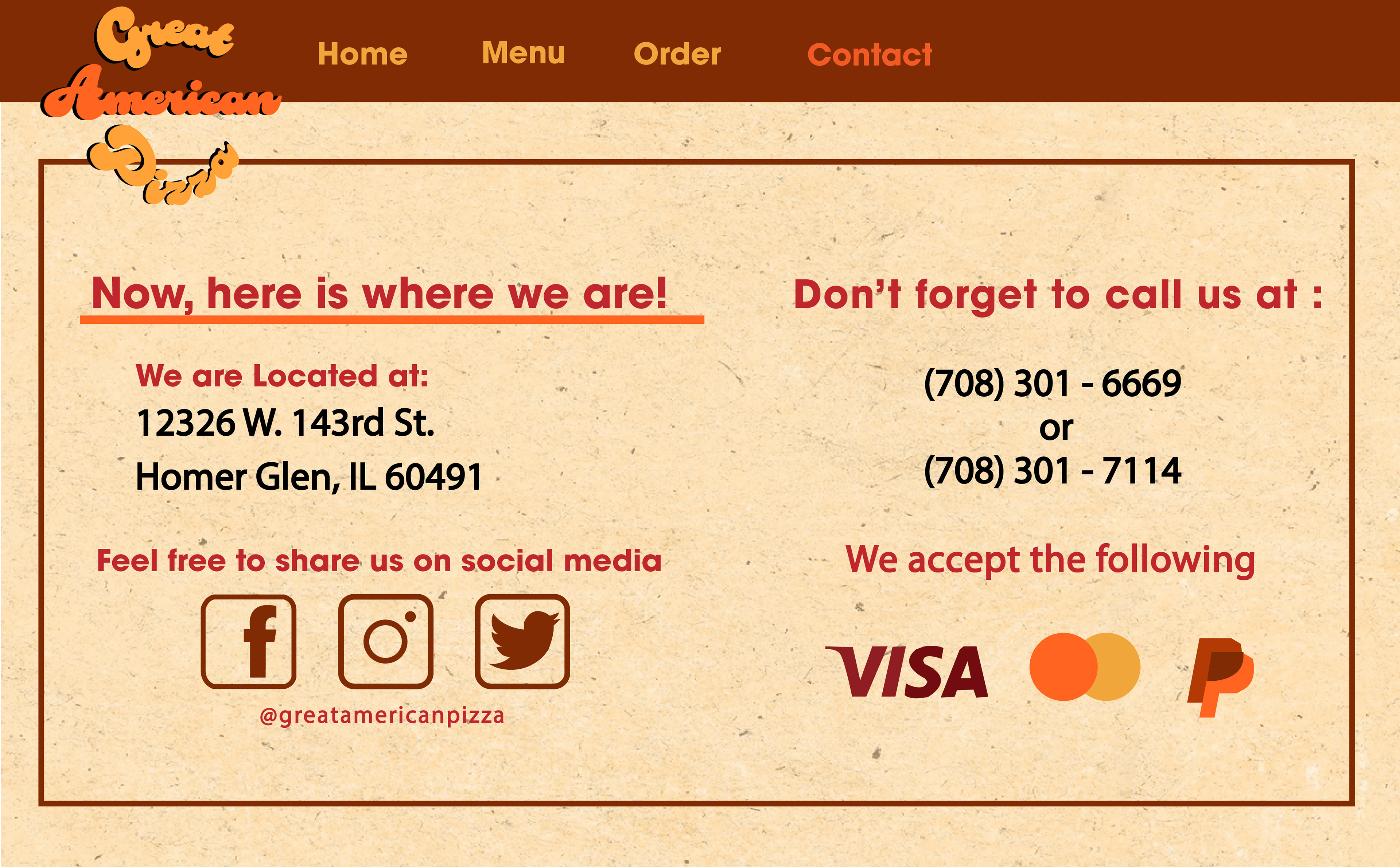
Contact Info
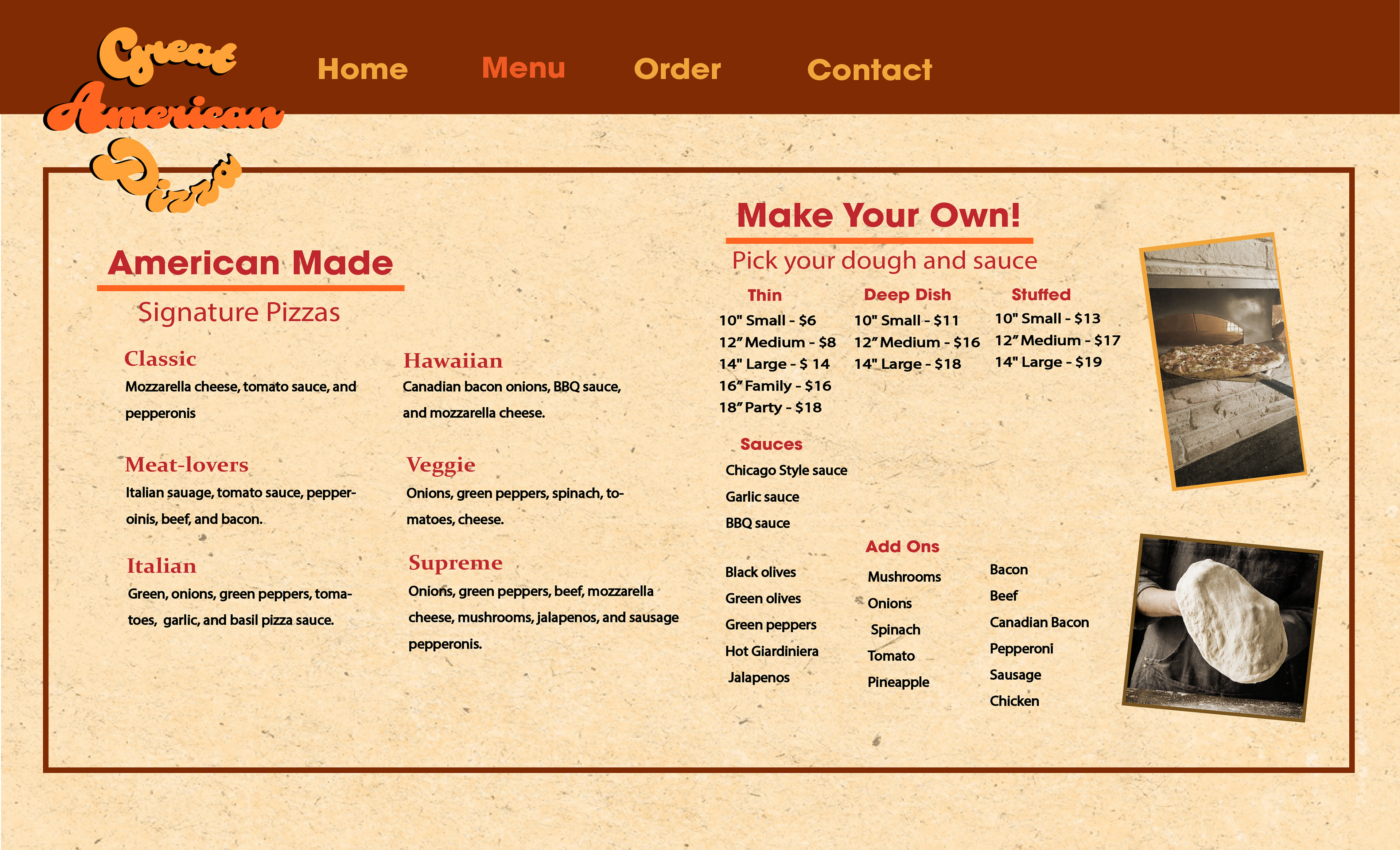
Online Menu
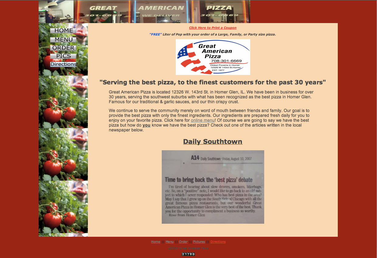
Website Info
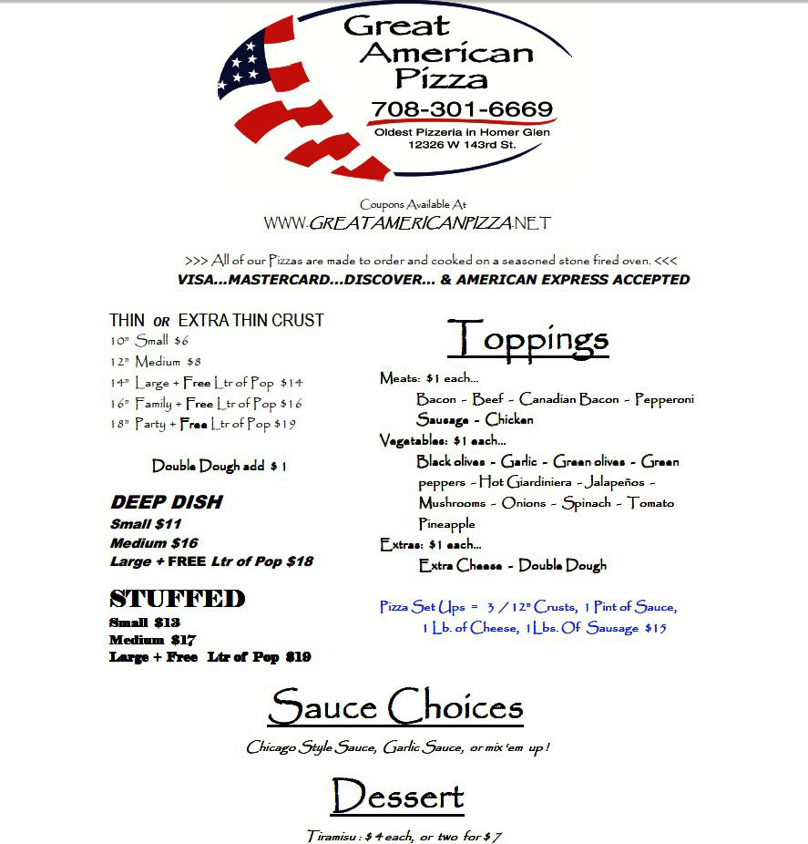
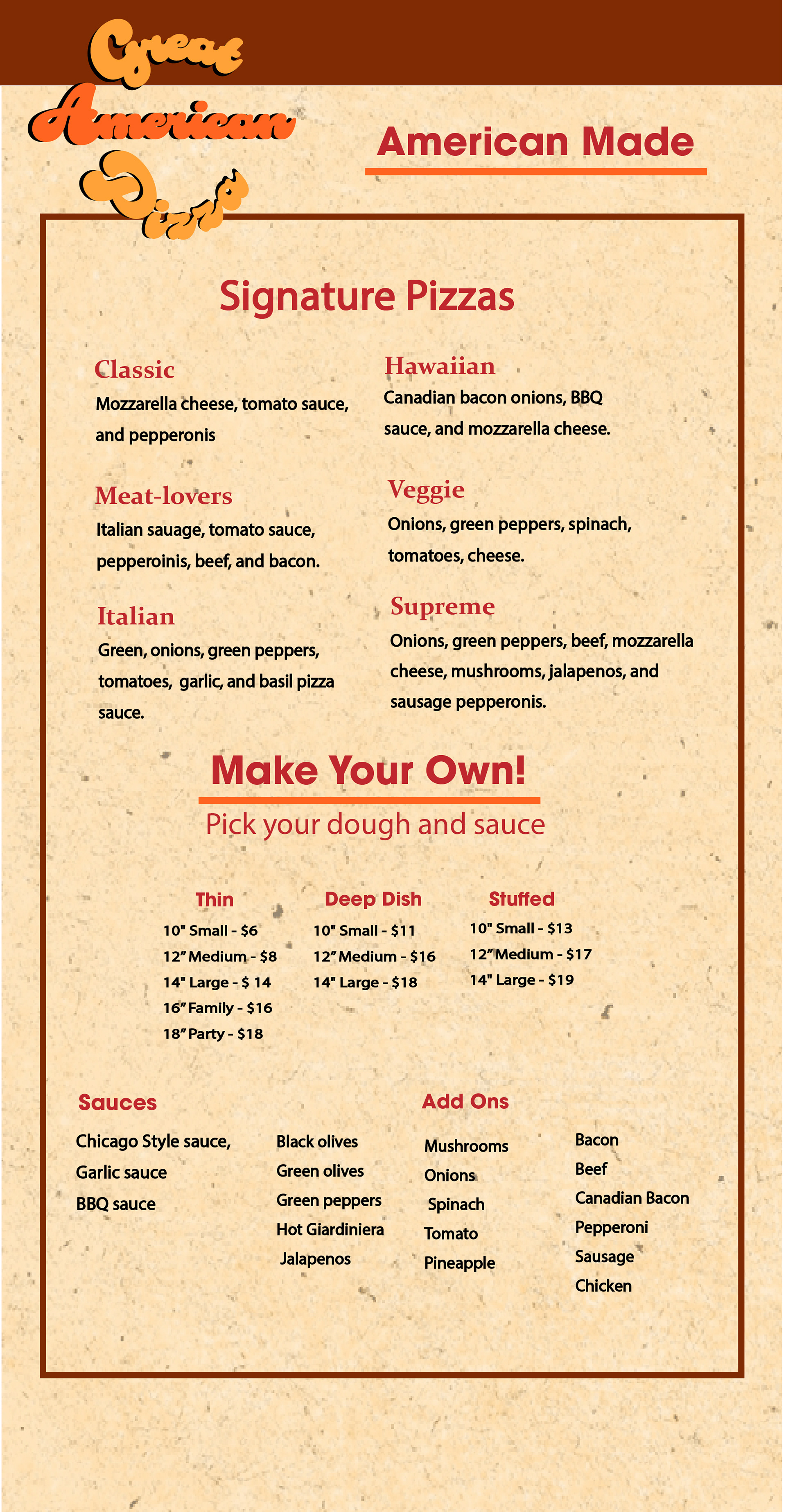
Menu
Throughout this process, I looked a various different pizza websites to draw inspiration. Some of the main inspirations I had during this process were Detroit based pizza companies such as: Buddy's Pizza and Little Caesars' Pizza.
In order to stay consistent with the retro appeal of the brand, I found it best matched the design of the brand to when the company initially started back in 1977. I wanted to create a brand that was best represented by